Clustering for dataset exploration
Contents
Clustering for dataset exploration#
Learn how to discover the underlying groups (or “clusters”) in a dataset. By the end of this chapter, you’ll be clustering companies using their stock market prices, and distinguishing different species by clustering their measurements.
Unsupervised Learning#
How many clusters?#
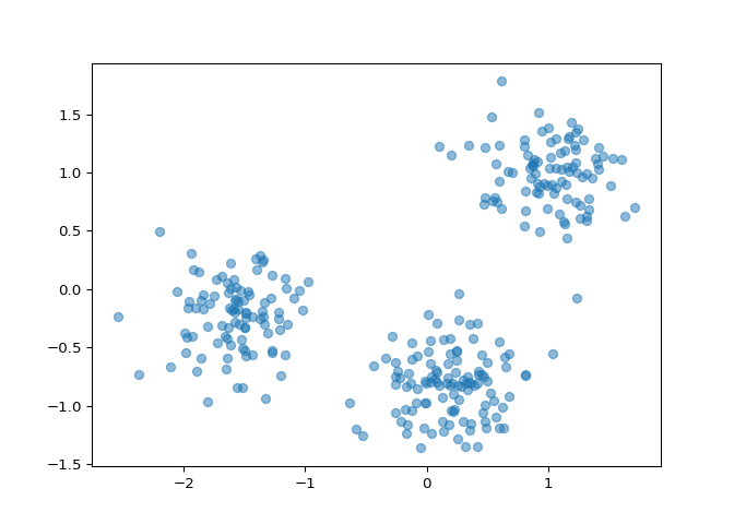
You are given an array points of size 300x2, where each row
gives the (x, y) co-ordinates of a point on a map. Make a scatter plot
of these points, and use the scatter plot to guess how many clusters
there are.
matplotlib.pyplot has already been imported as
plt. In the IPython Shell:
xs that contains the values of
points\[:,0\] - that is, column 0 of
points.
ys that contains the values of
points\[:,1\] - that is, column 1 of
points.
xs and ys to
the plt.scatter() function.
plt.show() function to show your plot.
How many clusters do you see?
# edited/added
import numpy as np
import pandas as pd
import matplotlib.pyplot as plt
points = np.array(pd.read_csv("archive/Unsupervised-Learning-in-Python/datasets/points.csv", header = None))
xs = points[:,0]
ys = points[:,1]
plt.scatter(xs, ys, alpha=0.5)
plt.show()

2
3
300
Correct! The scatter plot suggests that there are 3 distinct clusters.
Clustering 2D points#
From the scatter plot of the previous exercise, you saw that the points
seem to separate into 3 clusters. You’ll now create a KMeans model to
find 3 clusters, and fit it to the data points from the previous
exercise. After the model has been fit, you’ll obtain the cluster labels
for some new points using the .predict() method.
You are given the array points from the previous exercise,
and also an array new_points.
KMeans from sklearn.cluster.
KMeans(), create a KMeans instance
called model to find 3 clusters. To specify
the number of clusters, use the n_clusters keyword
argument.
.fit() method of model to fit the
model to the array of points points.
.predict() method of model to predict
the cluster labels of new_points, assigning the result to
labels.
new_points.
# edited/added
import numpy as np
import pandas as pd
points = np.array(pd.read_csv("archive/Unsupervised-Learning-in-Python/datasets/points.csv", header = None))
new_points = np.array(pd.read_csv("archive/Unsupervised-Learning-in-Python/datasets/new_points.csv", header = None))

# Import KMeans
from sklearn.cluster import KMeans

# Create a KMeans instance with 3 clusters: model
model = KMeans(n_clusters=3)

# Fit model to points
model.fit(points)

# Determine the cluster labels of new_points: labels
## KMeans(n_clusters=3)
labels = model.predict(new_points)

# Print cluster labels of new_points
print(labels)
## [0 1 2 0 1 0 1 1 1 2 0 1 1 2 2 1 2 2 1 1 2 1 0 1 0 2 1 2 2 0 0 1 1 1 2 0 1
##  1 0 1 2 0 0 2 0 1 2 2 1 1 1 1 2 2 0 0 2 2 2 0 0 1 1 1 0 1 2 1 0 2 0 0 0 1
##  0 2 2 0 1 2 0 2 0 1 2 1 2 0 1 1 1 0 1 1 0 2 2 2 2 0 1 0 2 2 0 0 1 0 2 2 0
##  2 2 2 1 1 1 1 2 2 1 0 1 2 1 0 2 1 2 2 1 2 1 2 0 1 0 0 1 2 0 1 0 0 2 1 1 0
##  2 0 2 1 0 2 2 0 2 1 1 2 1 2 2 1 1 0 1 1 2 0 2 0 0 1 0 1 1 0 0 2 0 0 0 2 1
##  1 0 2 0 2 2 1 1 1 0 1 1 1 2 2 0 1 0 0 0 2 1 1 1 1 1 1 2 2 1 2 2 2 2 1 2 2
##  1 1 0 2 0 0 2 0 2 0 2 1 1 2 1 1 1 2 0 0 2 1 1 2 1 2 2 1 2 2 0 2 0 0 0 1 2
##  2 2 0 1 0 2 0 2 2 1 0 0 0 2 1 1 1 0 1 2 2 1 0 0 2 0 0 2 0 1 0 2 2 2 2 1 2
##  2 1 1 0]
Great work! You’ve successfully performed k-Means clustering and predicted the labels of new points. But it is not easy to inspect the clustering by just looking at the printed labels. A visualization would be far more useful. In the next exercise, you’ll inspect your clustering with a scatter plot!
Inspect your clustering#
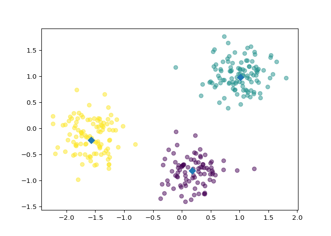
Let’s now inspect the clustering you performed in the previous exercise!
A solution to the previous exercise has already run, so
new_points is an array of points and labels is
the array of their cluster labels.
matplotlib.pyplot as plt.
0 of new_points to
xs, and column 1 of new_points to
ys.
xs and ys, specifying
the c=labels keyword arguments to color the points by their
cluster label. Also specify alpha=0.5.
.cluster_centers\_ attribute of model.
0 of centroids to
centroids_x, and column 1 of
centroids to centroids_y.
centroids_x and
centroids_y, using ‘D’ (a diamond) as a marker
by specifying the marker parameter. Set the size of the
markers to be 50 using s=50.
# Import pyplot
from matplotlib import pyplot as plt

# Assign the columns of new_points: xs and ys
xs = new_points[:,0]
ys = new_points[:,1]

# Make a scatter plot of xs and ys, using labels to define the colors
plt.scatter(xs, ys, c=labels, alpha=0.5)

# Assign the cluster centers: centroids
centroids = model.cluster_centers_

# Assign the columns of centroids: centroids_x, centroids_y
centroids_x = centroids[:,0]
centroids_y = centroids[:,1]

# Make a scatter plot of centroids_x and centroids_y
plt.scatter(centroids_x, centroids_y, marker='D', s=50)
plt.show()

Fantastic! The clustering looks great! But how can you be sure that 3 clusters is the correct choice? In other words, how can you evaluate the quality of a clustering? Tune into the next video in which Ben will explain how to evaluate a clustering!
Evaluating a clustering#
How many clusters of grain?#
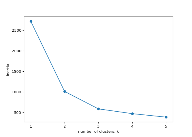
In the video, you learned how to choose a good number of clusters for a
dataset using the k-means inertia graph. You are given an array
samples containing the measurements (such as area,
perimeter, length, and several others) of samples of grain. What’s a
good number of clusters in this case?
KMeans and PyPlot (plt) have already been
imported for you.
This dataset was sourced from the UCI Machine Learning Repository.
k, perform the following
steps:
KMeans instance called model with
k clusters.
samples.
inertia\_ attribute of
model to the list inertias.
ks vs inertias has been
written for you, so hit submit to see the plot!
# edited/added
grains = pd.read_csv("archive/Unsupervised-Learning-in-Python/datasets/grains.csv")
samples = np.array(grains)[:,:7]
varieties = list(np.array(grains)[:,8])

ks = range(1, 6)
inertias = []

for k in ks:
    # Create a KMeans instance with k clusters: model
    model = KMeans(n_clusters=k)

    # Fit model to samples
    model.fit(samples)

    # Append the inertia to the list of inertias
    inertias.append(model.inertia_)

# Plot ks vs inertias
## KMeans(n_clusters=1)
## KMeans(n_clusters=2)
## KMeans(n_clusters=3)
## KMeans(n_clusters=4)
## KMeans(n_clusters=5)
plt.plot(ks, inertias, '-o')
plt.xlabel('number of clusters, k')
plt.ylabel('inertia')
plt.xticks(ks)
## ([<matplotlib.axis.XTick object at 0x7ffcdace2910>, <matplotlib.axis.XTick object at 0x7ffcdace2a60>, <matplotlib.axis.XTick object at 0x7ffcdace95e0>, <matplotlib.axis.XTick object at 0x7ffcdacf72e0>, <matplotlib.axis.XTick object at 0x7ffcdacf7610>], [Text(0, 0, ''), Text(0, 0, ''), Text(0, 0, ''), Text(0, 0, ''), Text(0, 0, '')])
plt.show()

Excellent job! The inertia decreases very slowly from 3 clusters to 4, so it looks like 3 clusters would be a good choice for this data.
Evaluating the grain clustering#
In the previous exercise, you observed from the inertia plot that 3 is a good number of clusters for the grain data. In fact, the grain samples come from a mix of 3 different grain varieties: “Kama”, “Rosa” and “Canadian”. In this exercise, cluster the grain samples into three clusters, and compare the clusters to the grain varieties using a cross-tabulation.
You have the array samples of grain samples, and a list
varieties giving the grain variety for each sample. Pandas
(pd) and KMeans have already been imported for
you.
KMeans model called model with
3 clusters.
.fit_predict() method of model to fit
it to samples and derive the cluster labels. Using
.fit_predict() is the same as using .fit()
followed by .predict().
df with two columns named
‘labels’ and ‘varieties’, using
labels and varieties, respectively, for the
column values. This has been done for you.
pd.crosstab() function on
df\[‘labels’\] and df\[‘varieties’\] to count
the number of times each grain variety coincides with each cluster
label. Assign the result to ct.
# Create a KMeans model with 3 clusters: model
model = KMeans(n_clusters=3)

# Use fit_predict to fit model and obtain cluster labels: labels
labels = model.fit_predict(samples)

# Create a DataFrame with clusters and varieties as columns: df
df = pd.DataFrame({'labels': labels, 'varieties': varieties})

# Create crosstab: ct
ct = pd.crosstab(df['labels'], df['varieties'])

# Display ct
print(ct)
## varieties  Canadian wheat  Kama wheat  Rosa wheat
## labels
## 0                       2          60          10
## 1                       0           1          60
## 2                      68           9           0
Great work! The cross-tabulation shows that the 3 varieties of grain separate really well into 3 clusters. But depending on the type of data you are working with, the clustering may not always be this good. Is there anything you can do in such situations to improve your clustering? You’ll find out in the next video!
Transforming features for better clusterings#
Scaling fish data for clustering#
You are given an array samples giving measurements of fish.
Each row represents an individual fish. The measurements, such as weight
in grams, length in centimeters, and the percentage ratio of height to
length, have very different scales. In order to cluster this data
effectively, you’ll need to standardize these features first. In this
exercise, you’ll build a pipeline to standardize and cluster the data.
These fish measurement data were sourced from the Journal of Statistics Education.
make_pipeline from sklearn.pipeline.
StandardScaler from sklearn.preprocessing.
KMeans from sklearn.cluster.
StandardScaler called
scaler.
KMeans with 4 clusters
called kmeans.
pipeline that chains
scaler and kmeans. To do this, you just need
to pass them in as arguments to make_pipeline().
# edited/added
fish = np.array(pd.read_csv("archive/Unsupervised-Learning-in-Python/datasets/fish.csv", header = None))
samples = fish[:,1:]
species = fish[:,0]

# Perform the necessary imports
from sklearn.pipeline import make_pipeline
from sklearn.preprocessing import StandardScaler
from sklearn.cluster import KMeans

# Create scaler: scaler
scaler = StandardScaler()

# Create KMeans instance: kmeans
kmeans = KMeans(n_clusters=4)

# Create pipeline: pipeline
pipeline = make_pipeline(scaler, kmeans)
Great work! Now that you’ve built the pipeline, you’ll use it in the next exercise to cluster the fish by their measurements.
Clustering the fish data#
You’ll now use your standardization and clustering pipeline from the previous exercise to cluster the fish by their measurements, and then create a cross-tabulation to compare the cluster labels with the fish species.
As before, samples is the 2D array of fish measurements.
Your pipeline is available as pipeline, and the species of
every fish sample is given by the list species.
pandas as pd.
samples.
samples by using the
.predict() method of pipeline.
pd.DataFrame(), create a DataFrame df
with two columns named ‘labels’ and ‘species’,
using labels and species, respectively, for
the column values.
pd.crosstab(), create a cross-tabulation
ct of df\[‘labels’\] and
df\[‘species’\].
# Import pandas
import pandas as pd

# Fit the pipeline to samples
pipeline.fit(samples)

# Calculate the cluster labels: labels
## Pipeline(steps=[('standardscaler', StandardScaler()),
##                 ('kmeans', KMeans(n_clusters=4))])
labels = pipeline.predict(samples)

# Create a DataFrame with labels and species as columns: df
df = pd.DataFrame({'labels': labels, 'species': species})

# Create crosstab: ct
ct = pd.crosstab(df['labels'], df['species'])

# Display ct
print(ct)
## species  Bream  Pike  Roach  Smelt
## labels
## 0            1     0     19      1
## 1            0    17      0      0
## 2            0     0      0     13
## 3           33     0      1      0
Excellent! It looks like the fish data separates really well into 4 clusters!
Clustering stocks using KMeans#
In this exercise, you’ll cluster companies using their daily stock price
movements (i.e. the dollar difference between the closing and opening
prices for each trading day). You are given a NumPy array
movements of daily price movements from 2010 to 2015
(obtained from Yahoo! Finance), where each row corresponds to a company,
and each column corresponds to a trading day.
Some stocks are more expensive than others. To account for this, include
a Normalizer at the beginning of your pipeline. The
Normalizer will separately transform each company’s stock price to a
relative scale before the clustering begins.
Note that Normalizer() is different to
StandardScaler(), which you used in the previous exercise.
While StandardScaler() standardizes
features (such as the features of the fish data from
the previous exercise) by removing the mean and scaling to unit
variance, Normalizer() rescales each
sample - here, each company’s stock price - independently of
the other.
KMeans and make_pipeline have already been
imported for you.
Normalizer from sklearn.preprocessing.
Normalizer called
normalizer.
KMeans called kmeans
with 10 clusters.
make_pipeline(), create a pipeline called
pipeline that chains normalizer and
kmeans.
movements array.
# edited/added
stock = np.array(pd.read_csv("archive/Unsupervised-Learning-in-Python/datasets/company-stock-movements-2010-2015-incl.csv", header = None, skiprows=1))
movements = stock[:,1:]
companies = list(stock[:,0])

# Import Normalizer
from sklearn.preprocessing import Normalizer

# Create a normalizer: normalizer
normalizer = Normalizer()

# Create a KMeans model with 10 clusters: kmeans
kmeans = KMeans(n_clusters=10)

# Make a pipeline chaining normalizer and kmeans: pipeline
pipeline = make_pipeline(normalizer, kmeans)

# Fit pipeline to the daily price movements
pipeline.fit(movements)
## Pipeline(steps=[('normalizer', Normalizer()),
##                 ('kmeans', KMeans(n_clusters=10))])
Great work - you’re really getting the hang of this. Now that your pipeline has been set up, you can find out which stocks move together in the next exercise!
Which stocks move together?#
In the previous exercise, you clustered companies by their daily stock price movements. So which company have stock prices that tend to change in the same way? You’ll now inspect the cluster labels from your clustering to find out.
Your solution to the previous exercise has already been run. Recall that
you constructed a Pipeline pipeline containing a
KMeans model and fit it to the NumPy array
movements of daily stock movements. In addition, a list
companies of the company names is available.
pandas as pd.
.predict() method of the pipeline to predict the
labels for movements.
companies by creating a DataFrame df with
labels and companies as columns. This has been
done for you.
.sort_values() method of df to sort
the DataFrame by the ‘labels’ column, and print the result.
# Import pandas
import pandas as pd

# Predict the cluster labels: labels
labels = pipeline.predict(movements)

# Create a DataFrame aligning labels and companies: df
df = pd.DataFrame({'labels': labels, 'companies': companies})

# Display df sorted by cluster label
print(df.sort_values('labels'))
##     labels                           companies
## 26       0                      JPMorgan Chase
## 1        0                                 AIG
## 3        0                    American express
## 5        0                     Bank of America
## 18       0                       Goldman Sachs
## 16       0                   General Electrics
## 55       0                         Wells Fargo
## 15       0                                Ford
## 30       1                          MasterCard
## 44       1                        Schlumberger
## 32       1                                  3M
## 53       1                       Valero Energy
## 13       1                   DuPont de Nemours
## 59       1                               Yahoo
## 10       1                      ConocoPhillips
## 8        1                         Caterpillar
## 35       1                            Navistar
## 57       1                               Exxon
## 2        1                              Amazon
## 12       1                             Chevron
## 42       2                   Royal Dutch Shell
## 43       2                                 SAP
## 41       2                       Philip Morris
## 46       2                      Sanofi-Aventis
## 28       2                           Coca Cola
## 19       2                     GlaxoSmithKline
## 20       2                          Home Depot
## 37       2                            Novartis
## 52       2                            Unilever
## 54       2                            Walgreen
## 6        2            British American Tobacco
## 49       2                               Total
## 39       2                              Pfizer
## 24       3                               Intel
## 47       3                            Symantec
## 23       3                                 IBM
## 50       3  Taiwan Semiconductor Manufacturing
## 51       3                   Texas instruments
## 56       4                            Wal-Mart
## 29       5                     Lookheed Martin
## 36       5                    Northrop Grumman
## 4        5                              Boeing
## 34       6                          Mitsubishi
## 7        6                               Canon
## 45       6                                Sony
## 58       6                               Xerox
## 48       6                              Toyota
## 21       6                               Honda
## 40       7                      Procter Gamble
## 9        7                   Colgate-Palmolive
## 25       7                   Johnson & Johnson
## 38       7                               Pepsi
## 27       7                      Kimberly-Clark
## 31       8                           McDonalds
## 17       9                     Google/Alphabet
## 14       9                                Dell
## 11       9                               Cisco
## 33       9                           Microsoft
## 22       9                                  HP
## 0        9                               Apple
Fantastic job - you have completed Chapter 1! Take a look at the clusters. Are you surprised by any of the results? In the next chapter, you’ll learn about how to communicate results such as this through visualizations.
